
Civilization VII's Deluxe Edition launched just a day ago, and online discussions are already buzzing about its user interface (UI) and other shortcomings. But is the criticism justified? Let's delve into the game's UI elements and assess whether the internet's assessment is accurate.
← Return to Sid Meier's Civilization VII main article
Is Civ 7's UI as Bad as They Say?
Early adopters of the Deluxe and Founder’s Editions have had barely a day with Civ VII, yet the game is already facing criticism, primarily targeting its seemingly subpar UI (alongside other missing quality-of-life features). While it's easy to join the chorus of complaints, let's objectively evaluate whether the UI truly deserves the harsh criticism. The best approach? A piece-by-piece analysis to determine if it meets the standards of a good, or at least functional, 4X interface.
What Makes a Good 4X UI?
Defining an objectively "good" 4X UI is tricky. A game's context, style, and goals significantly influence UI design, making universal rules difficult to apply. However, visual design principles reveal common elements found in successful 4X UIs. Let's use these principles to evaluate Civ VII's UI.
Clear Information Hierarchy
A clear information hierarchy prioritizes accessibility and relevance. Frequently used resources and mechanics should be prominent, while less critical features remain easily accessible. A good UI doesn't display everything at once; it organizes information logically.
Against the Storm provides a strong example. Right-clicking a building reveals a multi-tabbed pop-up menu. The default tab focuses on common actions (worker assignment, production), while less frequent functions are in subsequent tabs, prioritizing ease of use.
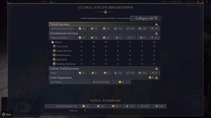
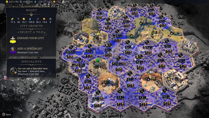
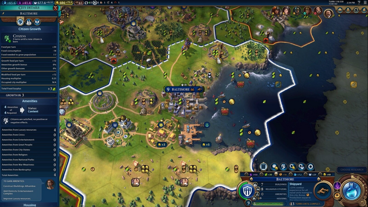
Let's examine Civilization VII's resource summary UI. It effectively displays resource allocation, separating income, yields, and expenses via dropdowns. The tabular format facilitates tracking, with detailed breakdowns available. However, it lacks specificity; while overall rural district yields are shown, individual district or hex contributions aren't. Expense breakdowns are also limited. It functions, but improved granularity would be beneficial.
Effective and Efficient Visual Indicators
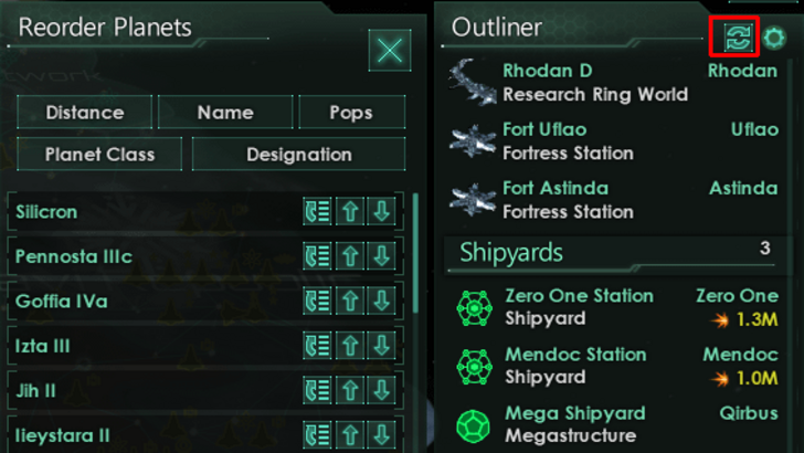
Effective visual indicators—icons, colors, overlays—convey information instantly, minimizing reliance on text. Stellaris's Outliner, though sometimes criticized for clutter, effectively uses visual indicators to show ship status (in transit, scanning, etc.) and colony needs.
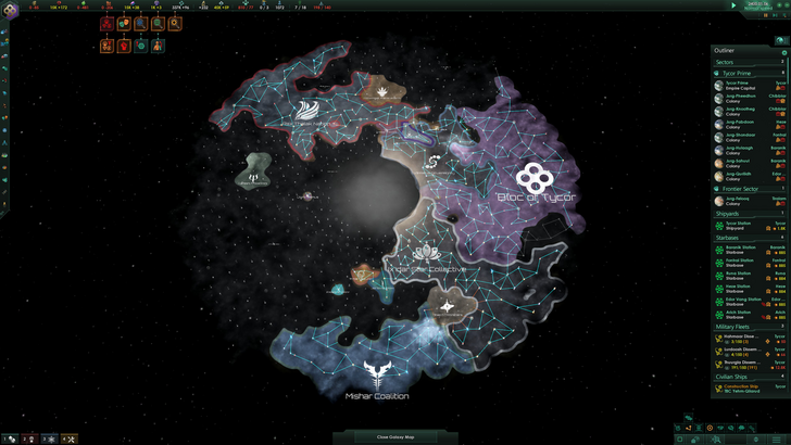
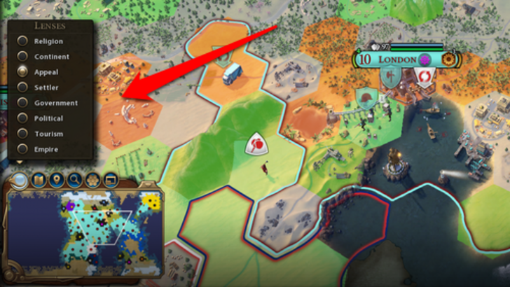
Civ VII utilizes iconography and numerical data for resources, but also includes effective visual indicators. The tile yield overlay, settlement overlay (color-coding hex viability), and settlement expansion screen (distinguishing tile types) are examples. However, the absence of certain lenses from Civ VI (appeal, tourism, loyalty) and customizable map pins is a drawback. While not terrible, there's room for improvement.
Searching, Filtering, and Sorting Options
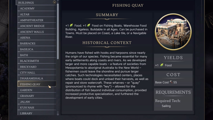
In complex 4X games, search, filtering, and sorting options are crucial for managing information. Civ VI's robust search function allows players to locate resources, units, and features on the map, seamlessly linking to the Civilopedia.
Civ VII lacks this crucial search function, a significant usability issue. The absence severely impacts navigation, especially given the game's scale. This is a major shortcoming that hopefully Firaxis will address.
Design and Visual Consistency
UI aesthetics and cohesiveness are vital. Civ VI's vibrant, cartographic style seamlessly integrates with its overall aesthetic, reinforcing its identity.
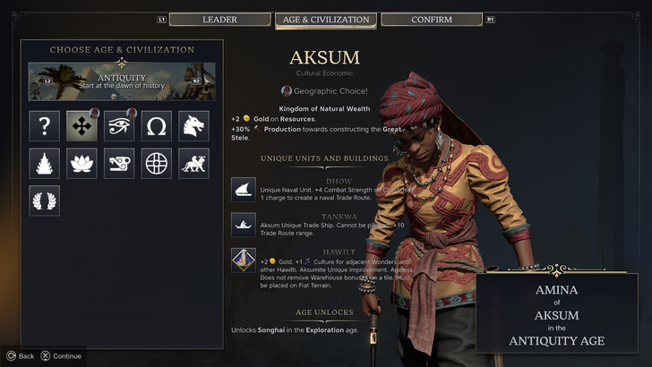
Civ VII adopts a minimalist, sleek design. The restrained color palette aligns with its aesthetic, but lacks the visual impact of Civ VI. This more subtle approach has resulted in mixed reactions, highlighting the subjective nature of visual design.
The Verdict: Not the Best, But Not as Bad as Claimed
Civ VII's UI, while not perfect, doesn't deserve the extreme criticism. The missing search function is a significant flaw, but not game-breaking. Compared to other issues, it's relatively minor. While it pales in comparison to some visually striking 4X UIs, it possesses strengths. With updates and player feedback, it can improve significantly. The current state, however, isn't as disastrous as many claim.
← Return to Sid Meier's Civilization VII main article
Sid Meier's Civilization VII Similar Games


![Tower of God: New World introduces SSR+ [Capricious Tactician] Yasratcha in the latest update](https://img.17zz.com/uploads/98/174064685167c029c3569c2.jpg)